
CASE STUDY - UX / interaction design
Vuse Subscription Redesign
dcbel builds a smart home energy system that manages solar, electric vehicle battery, backup energy storage, and grid power from a single wall-mounted unit. Its interface failed during real internal field testing during a blackout. I led the redesign, and it shipped on time.
Figma, Hotjar
Problem discovery
Mixed-methods research
User flows
Interaction design
Cross-functional collaboration
Post-launch analysis
01 -
CONTEXT
A churn problem that turned out to be a self-service gap. Users were cancelling because there was no way to make a change.
I attended weekly Customer Care syncs and kept hearing the same thing. Customers cancelled recurring subscriptions not because they wanted to leave, but because the platform gave them no other way to change them.
how might we
How might we empower Vuse subscribers to self-manage every aspect of their subscription, from flavours and quantity to payment and delivery, without ever needing to contact Customer Care?
70% reduction in complaints
Reduction in subscription-related complaints, measured over 3 months post-launch.
25% of online revenue protected
Of the total, Vuse's online revenue comes from subscriptions. The fix protected the business.
02 -
DISCOVERY
"I want to change flavours, but there's no option. I have to cancel and re-subscribe" - Vuse customer.
Across the surveyed subscribers, the verbatims pointed to one interaction gap. I used the data to build a business case and pitched the redesign to the Product Owner and Digital Manager, grounding the ask in the channel's 25% revenue contribution.
03 -
Strategy
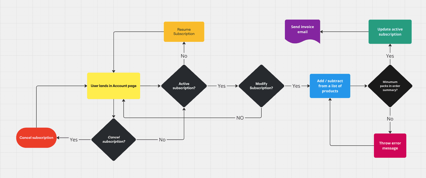
Mapping the existing flow made the failure obvious. Every meaningful change required affordability.
After sign-off, I built a user flow map of the decision tree that subscribers follow when modifying an active subscription. I then shared it with Engineering and Customer Care to validate feasibility.
04 -
Design process
I skipped wireframes on purpose since the change was additive, and the design already had the patterns.
I moved straight to high-fidelity Figma prototypes, which communicated interaction states far better than the wireframes would have.
I also added an order invoice view, a capability previously absent, which created pricing confusion for customers.
Structurally, I preserved the existing page architecture and added capability within. This kept implementation velocity high and regression risk low on revenue-critical service.
05 -
Post-launch iteration
The highest-impact change in the project came after launch, from Hotjar recordings.
While monitoring session recordings, I saw users start modifications and abandon them halfway for unknown reasons.
To capture modifications before committing, I introduced a Draft Order state. This state clearly labelled the actions users could take: Discard, Submit, or Continue Modification.

06 -
Constraints & collaboration
Sharing flows early turned three cross-functional dependencies into design inputs rather than late blockers.
Engineering
In a post-launch iteration, quick alignment on cookie-based paermissions surfaced early UI constraints.
Legal & Compliance
Any shipping or billing address change required an Equifax identity check to confirm the legal age threshold. I designed the flow to surface this check clearly rather than fail silently, removing a major source of escalations.
Customer Care
As both a research and validation partner, I reviewed the proposed flows to confirm that the new self-serve capability addressed the ticket categories they handled most often.
07 -
Lessons learned
LESSON 01
Initiative is a design skill
This project was not on the roadmap. I found the problem, built the evidence, and pitched the solution. The best work often starts with a problem no one has yet assigned.
LESSON 02
Design does not end at launch
The Draft Order feature, introduced post-launch based on Hotjar monitoring, is equally important as the design phase.
LESSON 03
Constraints sharpen decisions